
Artemy Website
UX DESIGN | RESPONSIVE WEBSITE
A marketing website to attract users to download a new art-sharing app.

Goal
Create a marketing website for my mobile app, Artemy, to entice users to download the app.
The purposes of my marketing landing page are to:
-
Show users that my app is meant for them (using design that targets my audience)
-
Demonstrate how my app can fix users' problems
-
Explain exactly how my app’s features/functions can help users
-
Reassure users with the success stories from reviewers
-
Build rapport with users through Artemy’s founding story
When users feel that they’ve experienced the above, they will be more inclined to download my app.
Tools used: Figma, InVision
Skills applied: Double-diamond process, user-centered approach, usability testing, wireframing, prototyping
Outcome
Designed a website landing page with a features section, an about section, and a reviews section.
Design Development


Design Iterations
I injected colors into my mid-fi wireframes to create hi-fi designs using the same color palette as the Artemy app. However, I had trouble styling the site to match Artemy’s tone and branding.

When I presented my hi-fi wireframes to my peers, I received the following feedback (ordered by most effective and achievable to least):
-
Add a site language option - improve accessibility
-
Add more links to info in footer - improve help + documentation
-
Choose either a more mature style (gradient wave design) or cute style (illustrated icons)
-
More eye-catching prototyping to engage users
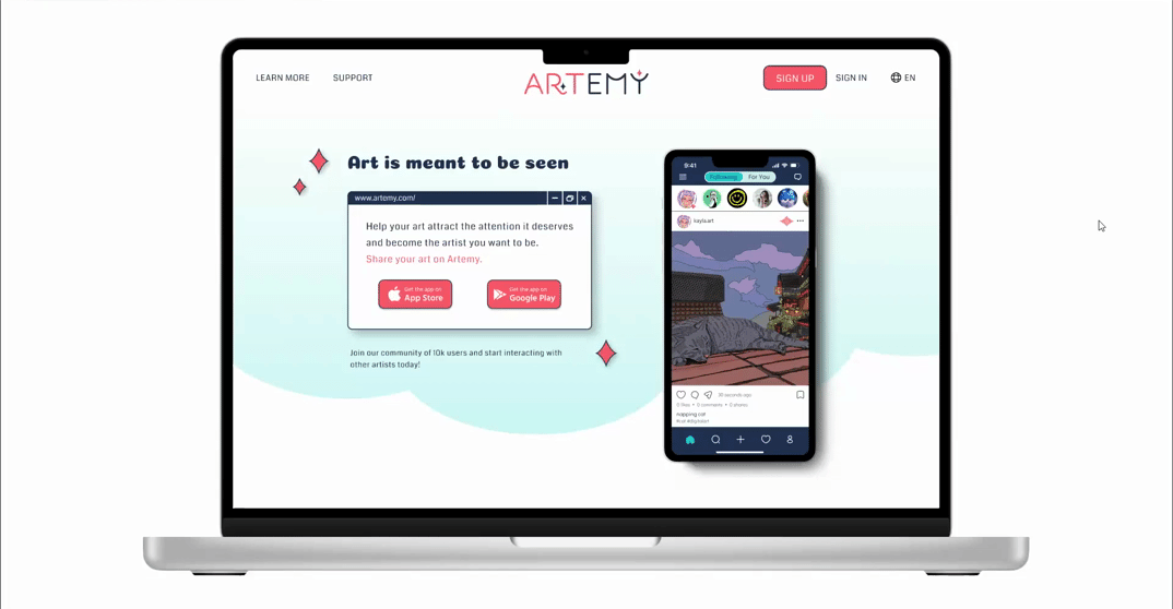
I realized I needed to change the styling of my website as it was too generic and didn’t have a direction. I must create a separate look-and-feel for my website - one that’s not necessarily the same as my app but targets my persona Kayla, and encourages similar users to download my app. I chose the browser frames aesthetic with soft pastel colors because it’s a cute, youthful style that also screams “I love my technology” - perfect for Kayla and similar users.
Design Iterations
During usability testing, I found that users were having trouble allocating points into posts due to the excess information displayed, so I changed the UI to make it cleaner and simpler.


Design Impact
After testing the hi-fi prototype with 5 artists, results show that the Artemy marketing website has a strong positive impact on the audience. 100% of participants expressed interest in downloading the app to try it out.
What I Learned
There's relatively more freedom when it comes to the design and aesthetic of websites compared to apps, especially social media apps, which more or less follow a layout formula and have a set multitude of functions built into a smaller screen. Because of this, marketing websites could and should be designed using different inspiration and mood boards. To catch the eye of consumers, the site should be designed with more creativity, and to convert the interest into downloads, it should display enough information at the same time.
Next Steps
-
Develop all other task functions and task flows in Artemy (profile, settings, photo selection screens, etc.).
-
Translate prototype over from mobile to tablet, creating content flow diagram and making templates for and designing screens for tablet.